Writing Process Redesign
Redesigning how GCU students learn to write — from a single overwhelming page to an eight-stage guided experience.
Role
Product Design Intern
Grand Canyon Education
Duration
2025
8 weeks
Scope
UX Redesign
Figma, Illustrator
Team
1 designer (me)
1 PM, 1 dev
Mentored by 3 senior designers
During my internship at GCE, I redesigned a student-facing writing resource. It started as a single, content-heavy page. The material was strong, but the experience had aged — instructional content buried in menus, no clear path through the writing process.
My goal was to improve how students discover, navigate, and absorb writing instruction while aligning with GCU's UI and accessibility standards. It's now shipped and in final review before live deployment.
Designed For Students Who
- Feel unsure where to begin when given a writing assignment
- Struggle to locate relevant writing help at the right moment
- Become overwhelmed by dense, all-in-one resource pages
- Benefit from structured guidance through complex tasks
Role
Product Design Intern
Company
Grand Canyon Education / GCU
Status
Shipped
Timeline
8 weeks
Tools
Figma, Illustrator
Project Type
Educational Media Redesign
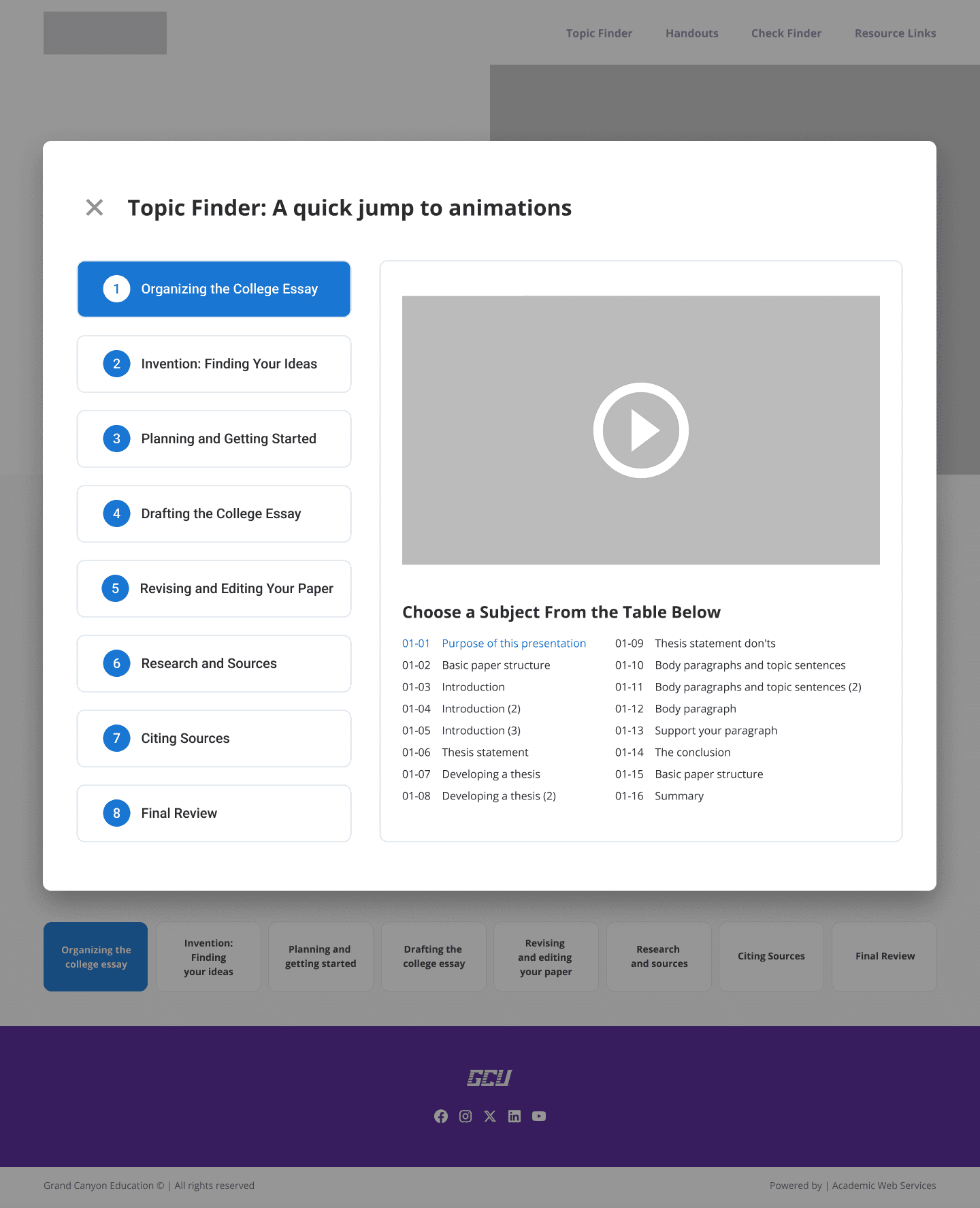
The original resource packed the entire writing process into a single page.
To access any specific stage — prewriting, drafting, revision — students had to dig through menus and tabs. The content was all there, but the structure worked against the people it was meant to help.
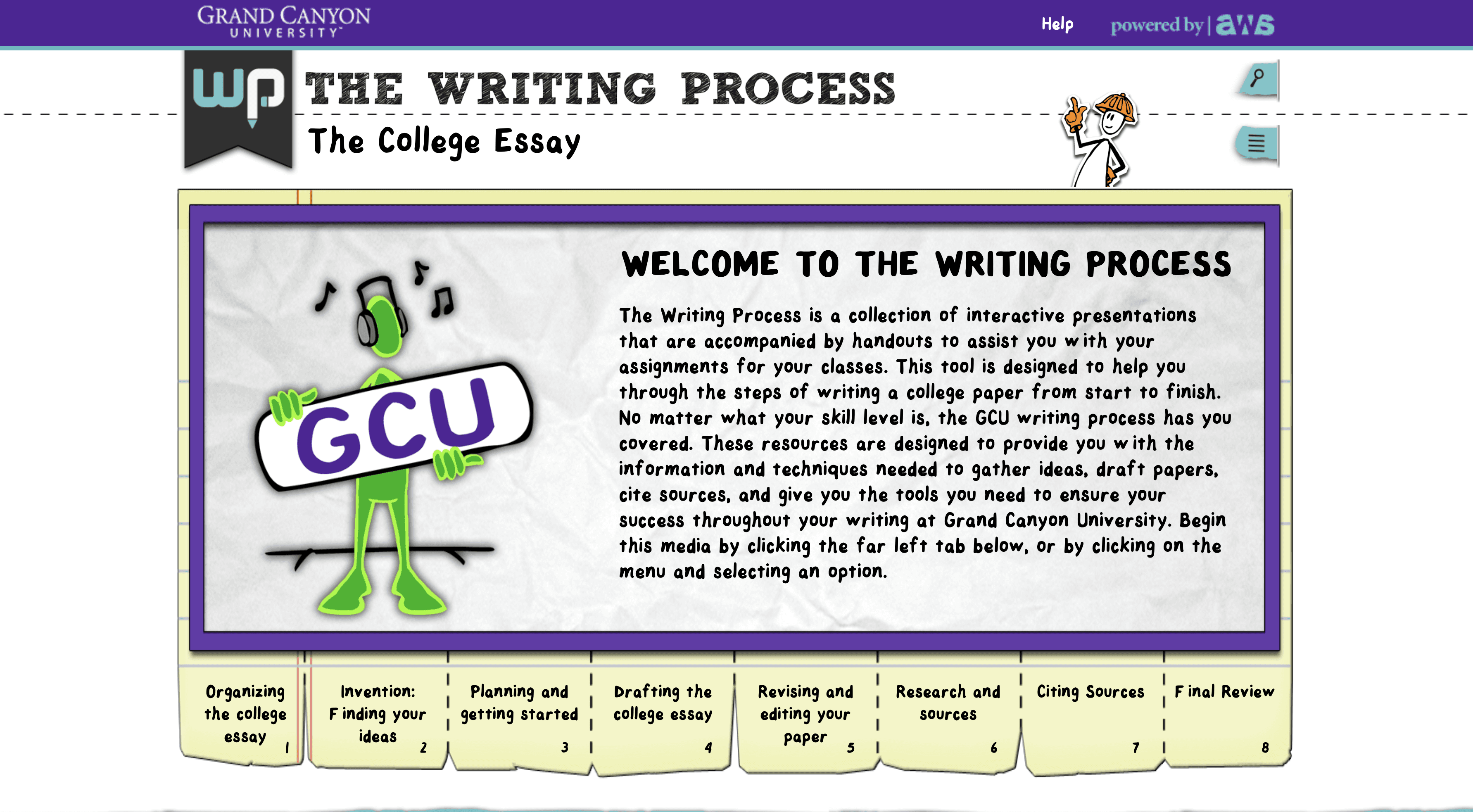
Problem 01
No visible progression through the writing process.
Students had no sense of where they were or what came next. The entire writing journey was compressed into a single scrollable page with no sense of forward movement.
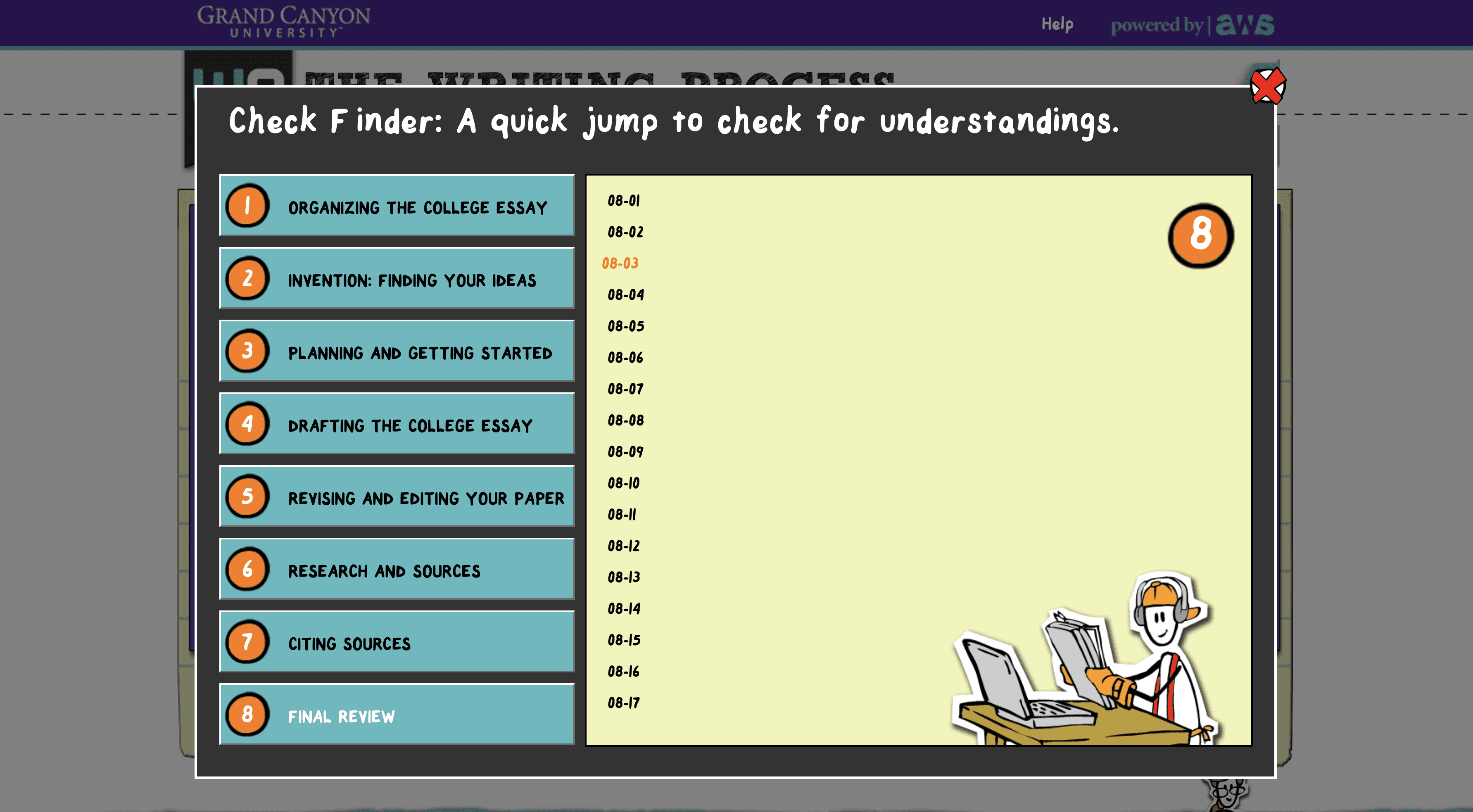
Problem 02
Instructional media was buried instead of surfaced.
Videos and downloadable resources lived in menus and modals rather than alongside the relevant instruction. Students who needed help had to go hunting for it.
Problem 03
The interface placed the burden of assembly on the student.
It was built for exploration, not instruction. Students were expected to self-navigate a complex resource at the exact moment they needed clear, sequential guidance.
Before touching Figma, I reviewed comparable student-facing writing platforms. A clear pattern emerged: the tools that worked best gave students what they needed at each stage of the process — not everything at once.
I also spoke with students between classes — asking how they used writing resources, what frustrated them, and whether they'd turned to Google or YouTube instead. The pattern was consistent: official tools felt overwhelming, so most students either skimmed and gave up, or bypassed them entirely.
“Navigating the old resource, it was easy to get lost — like information was hidden in menus even when it was all related.”
GCU student, informal research session
The problem wasn't the content — it was the structure around it.
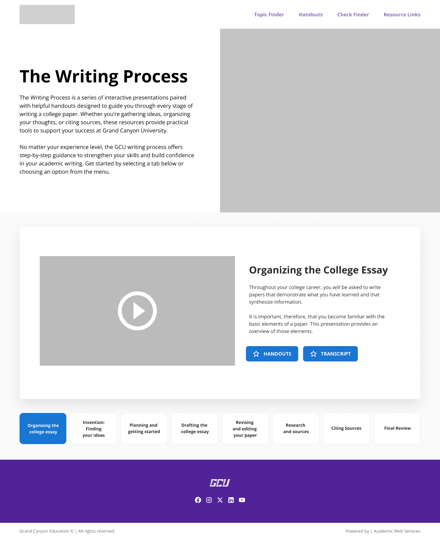
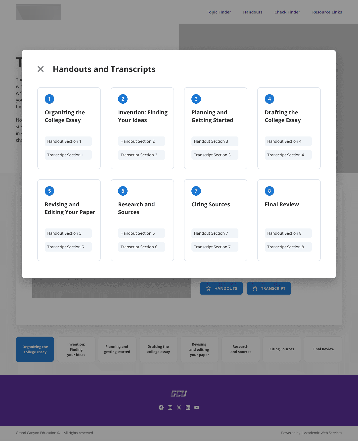
My first approach improved clarity within the existing one-page model. I introduced a centralized landing page with modal-based access to videos, handouts, and transcripts. The goal was to test whether better visual organization alone could solve the problem before proposing a bigger structural change.
What the feedback revealed
The visual improvements landed well. But something more fundamental kept surfacing: students still felt overwhelmed by seeing the entire writing process at once.
Even with cleaner layout and modals, the single-page model created a wall of information with no clear entry point. Opening a video in a modal made it harder to stay oriented. Videos and resources felt disconnected from the instruction they were meant to support.
I'd been treating it as a visual design problem. Users were telling me it was structural.
The pivot didn't start with the data — it started in a design review. During a progress presentation, the Head of AWS at GCE (my manager) suggested moving to a fully linear model: each stage of the writing process on its own dedicated page.
How it was validated
I went back and wireframed the new structure. At the next weekly design meeting — with my manager, two senior designers, a mid-level designer, and the video team — the new direction was immediately approved. It aligned with the vision: each section having its own page, its own focus.
From there, the work was mine: take all the content scattered across the original piece — written instruction, embedded videos, downloadable resources — and organize it across eight dedicated pages in a way that actually made sense to students. The eight stages weren't arbitrary. They emerged from the content itself — identifying which subjects in the original resource carried enough weight to stand alone.
A meaningful scope change mid-project. The right call.
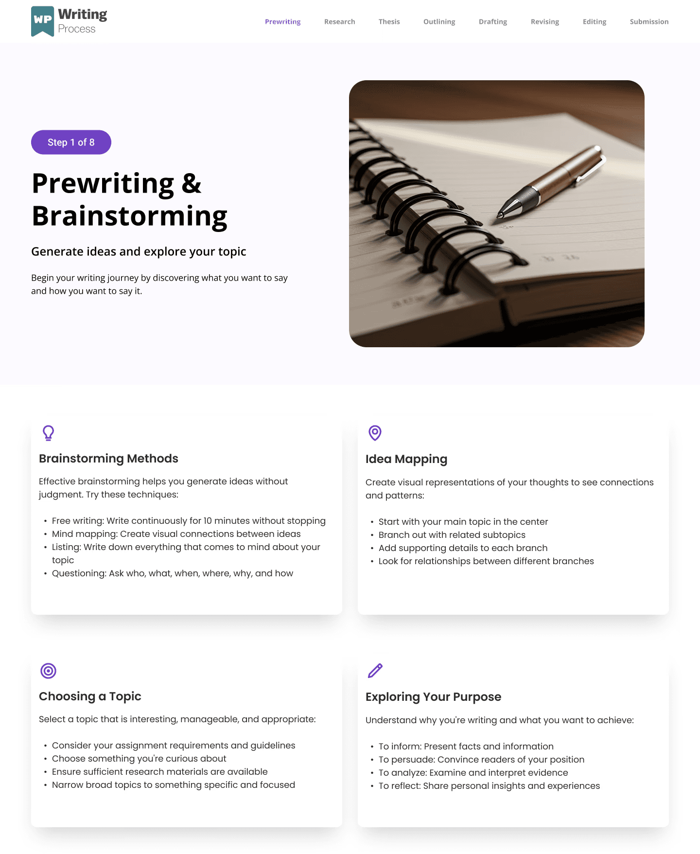
The final design presents the writing process as a clear, progressive journey across eight dedicated pages.
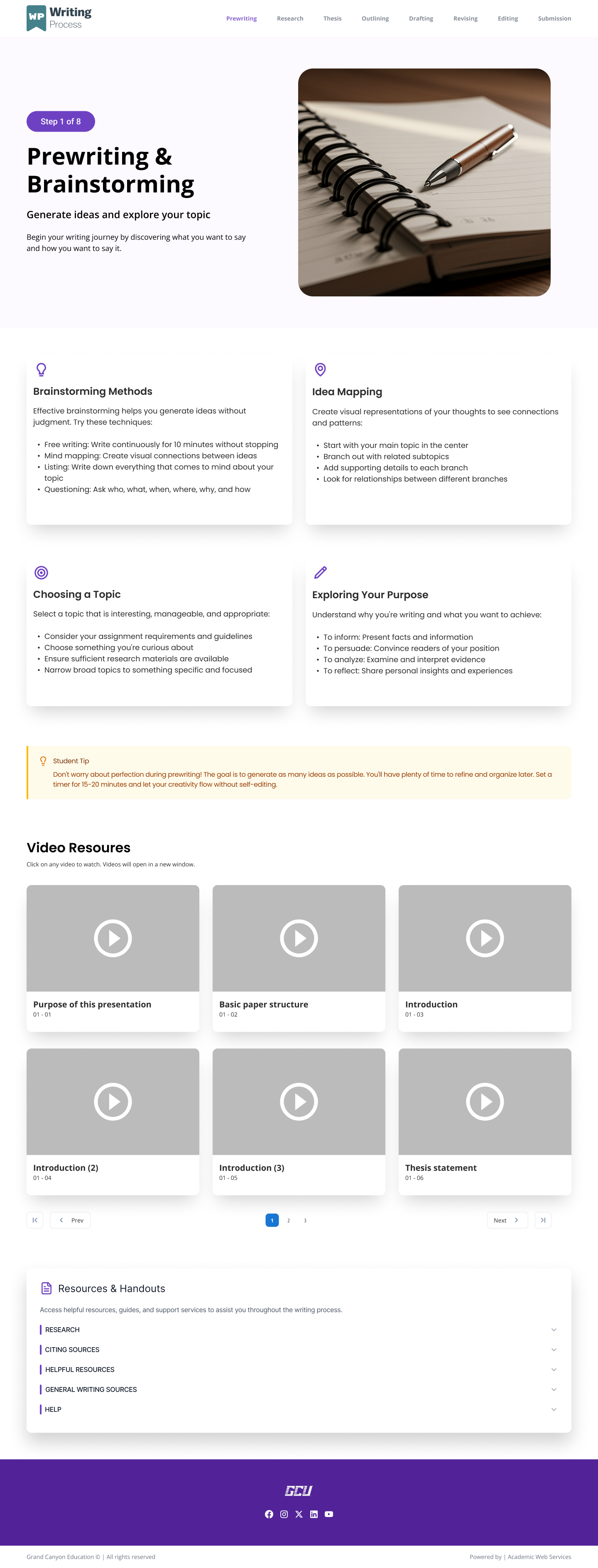
- A plain-language summary of the stage and its purpose
- Embedded instructional video surfaced in context — not buried in a modal or a menu
- Downloadable handouts and resources tied to that specific step
- A persistent resources section at the bottom of every page, so students always know where to go for help
- Clear navigation to the previous and next stage
Students no longer need to figure out where they are or what comes next. The experience guides them forward.
The redesigned experience is awaiting a final presentation to GCU's writing department before developer handoff and live deployment. During informal feedback sessions, students navigating the redesigned flow were able to identify their starting point and next step without prompting — something the original single-page format didn't support.
Discoverability
Content surfaced where students actually need it.
Each page presents only what's relevant to that stage — nothing competes for attention. Students encounter the right resource at exactly the right moment.
Comprehension
One stage at a time reduces cognitive load.
Dedicated pages let students focus on prewriting, or revision, or citation — without the rest of the process in view at the same time.
Engagement
Videos and resources are embedded in context, not tucked behind a modal.
Students no longer have to decide whether to open supplemental content. It's already there, at the right moment, on the right page.
Standards Alignment
The redesign meets GCU's UI and accessibility requirements throughout.
From typography and color contrast to responsive layouts, every decision was made within GCU's established design guidelines.
This project was completed during my internship at GCE. The redesigned resource is currently in final review before live deployment at Grand Canyon University.