No. 2
A gut health iOS app designed and built solo in two weeks. Live on the App Store.
Role
Designer & Developer
Duration
2026
~2 weeks
Scope
0 to 1 iOS app
Built with Claude Code
Team
Solo build
I built a gut health app from scratch in two weeks. Design, code, backend, brand. All me. No team, no handoffs. Just me, Claude Code, and a problem I thought was worth solving. It is now live on the App Store.
My own research on colorectal cancer in younger adults made it feel personal — gut issues have been part of my life for a while. The idea of a poop tracker had floated around before, mostly as a joke. But a close friend asked me one day why I hadn't just built it, and I didn't have a good answer. So I did. The timing was right too — Claude Code was becoming a real tool, and I wanted something in my portfolio I'd taken from zero to shipped.
Colorectal cancer is now the number 1 cause of cancer death in adults under 50 in the U.S. — up from 5th place. The symptoms show up years before a diagnosis. Most people ignore them because nobody told them it was worth paying attention to.
Insight 01
Nobody tracks their gut health until something is already wrong.
There is no habit around this. No baseline. People go years without thinking about it, and then something changes and they have nothing to compare it to. No. 2 is about building that baseline before you need it.
Insight 02
The apps that exist are either scary or useless.
They split into two camps. Cold and clinical, like filling out a medical form. Or so soft and vague they had nothing useful to say. Nobody was making something you would actually want to open every day.
Insight 03
If it is not fast, people will not do it.
Logging has to be frictionless or it just does not happen. Health tracking apps live and die by whether people actually do it every day. That meant the whole input flow had to be designed around speed first.
I had never built a backend before. So I learned one.
Going into this I was a designer. I knew Figma. I did not know what row-level security was, what a Supabase migration was, or why an API key being exposed in a chat window was a problem. I used Supabase for the backend and spent a serious amount of time researching security standards before writing a single line. Input validation at the database level. Rate limiting on login attempts. No sensitive data in the app bundle. It was one of the harder parts of the project. But it made me a better product thinker because I now understand what I am actually asking engineers to build when I spec something out.
I started with AI insights. Then I did the math.
The original plan was to run every log through an AI model. At $0.003 per call, once a day per user, that is $1.10 per user per year. At 10,000 users that is $11,000 a year before a single dollar of revenue. So I built a rule-based engine instead. Runs on the device, costs nothing. AI becomes a Phase 2 premium feature when there is actually money to pay for it.
The UI went through a lot of versions.
I did not land on the final design on the first try. Not even close. The home screen alone went through five or six distinct directions before it felt right. A lot of the process was me describing a very specific feeling to Claude Code. Not just "make it look clean" but things like "the card should feel like it has weight, the spacing needs to breathe more, the green should feel calm not medical." It was a different kind of design process than Figma but the eye for detail was the same.
First iterations
Onboarding that actually sets you up.
The onboarding asks about your health goals and any existing conditions. That context shapes what the app pays attention to from day one. It also had to feel warm and easy because gut health is already an awkward topic for most people.
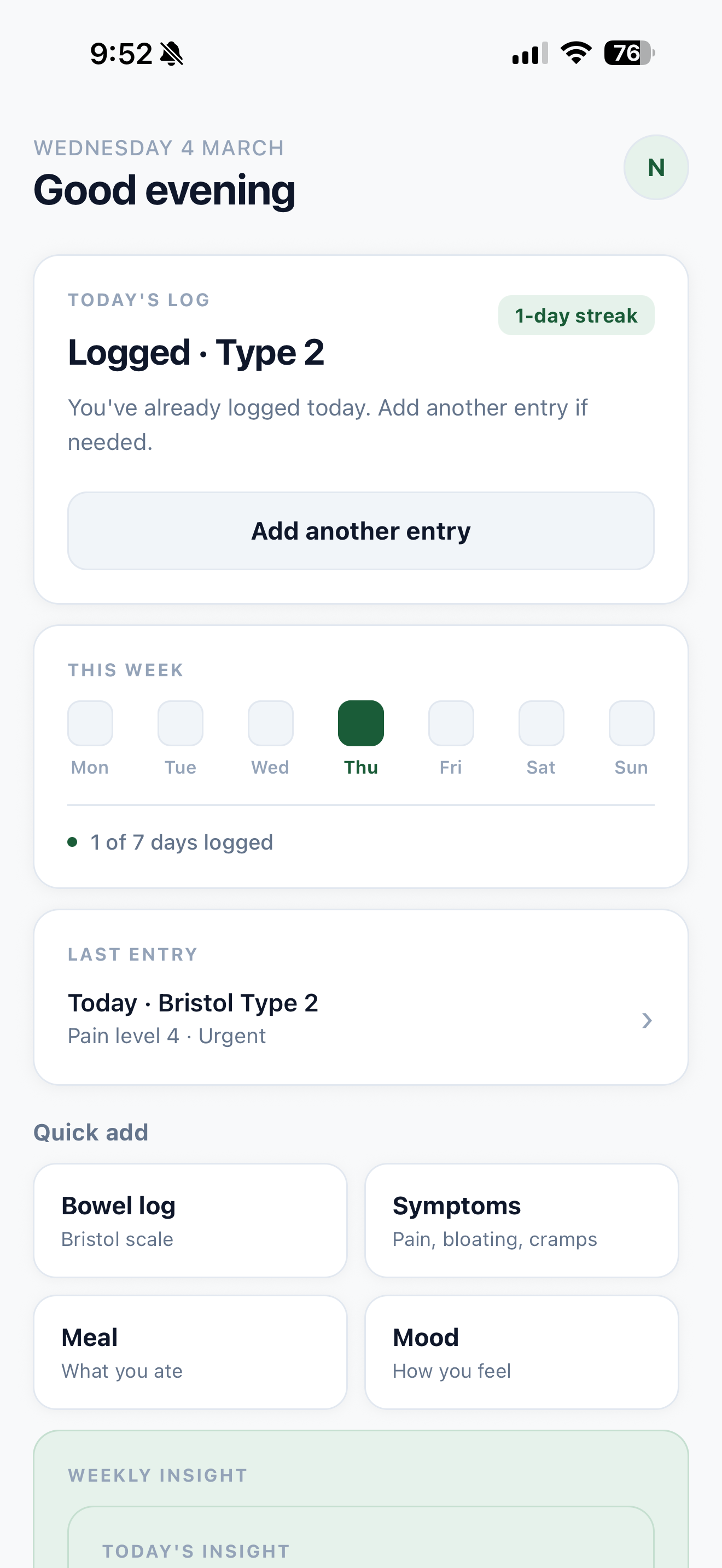
Logging that gets out of your way.
Tap your Bristol type, rate any discomfort, add a quick note if you want. Done. The Bristol Stool Scale is the input method because it is what doctors actually use, so every log is medically meaningful even if you never think about it that way.
A home screen that tells you where you stand.
Streak count, last log, a nudge if you have not logged today. Designed to feel like a quick check-in, not a dashboard you have to decode.
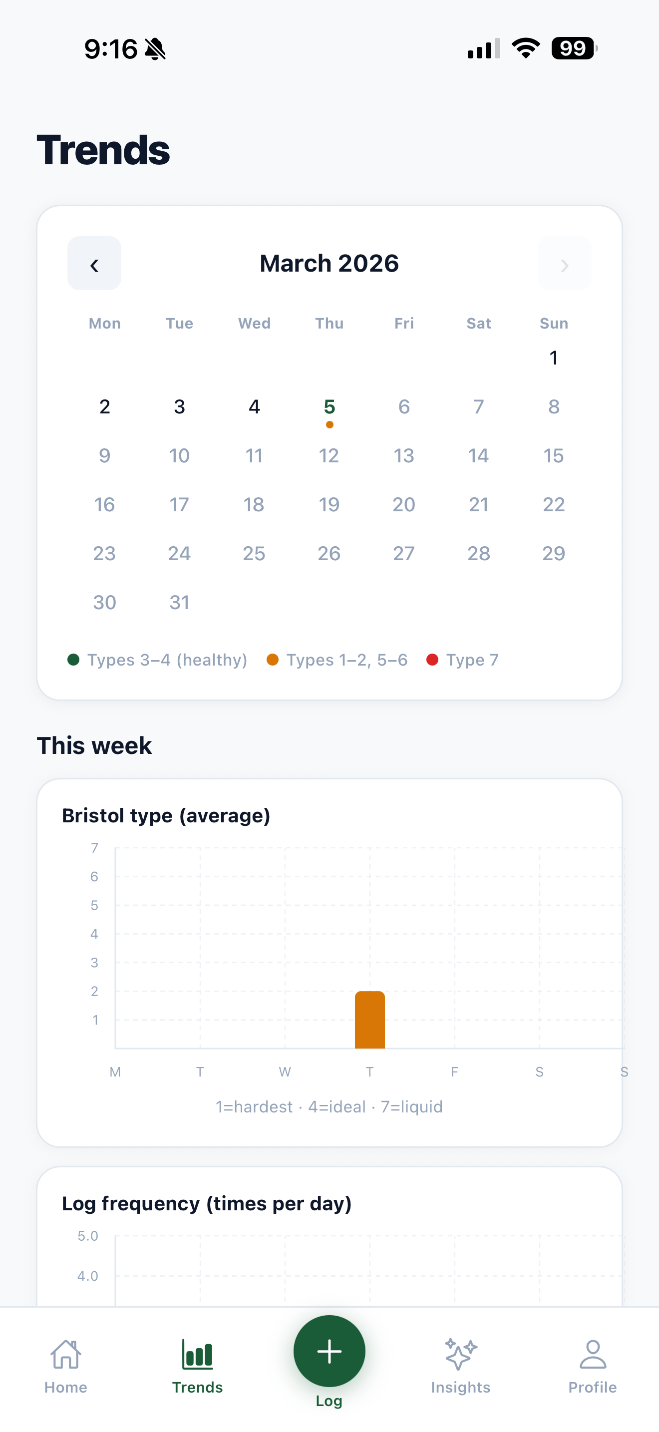
A calendar so you can actually see your patterns.
The calendar maps every log across the month. At a glance you can see how consistent you have been and spot patterns across days or weeks. Most health apps bury this view. Here it is front and center.
Insights that mean something, not just charts.
Your Bristol average, your discomfort trend, whether things are improving or not. The Apple Watch style rings make it quick to read. The copy explains it in plain language. No medical degree required.
Export everything to a PDF for your doctor.
If something feels off, you can export your full log history as a clean formatted PDF straight from the app. No screenshots, no trying to explain it from memory. Just show your doctor the data.
Design Decision
The carousel slowed people down. The list didn't.
The first logging flow showed Bristol types in a scrolling carousel. Users had to swipe through options without seeing them all at once — which meant extra decisions, extra time. Switching to a full list view, with illustrated icons for each type, changed everything. Users could immediately spot their type and tap it. No scrolling required.
The icons weren't just aesthetic. “Mushy” or “watery” means different things to different people — a small illustration anchors the meaning instantly. The result: average logging time dropped from around a minute to under 20 seconds.
~1 min
Carousel
~20 sec
List view
The name is the whole brand strategy.
No. 2. Everyone knows what it means. Slightly funny, immediately clear, owns the subject instead of tiptoeing around it. The tagline was obvious: The No. 1 app for your No. 2. The logo dot is a colon. The punctuation mark and the organ. Two meanings, one mark.
Phase 1 is just getting it out the door. Ship it, prove the core experience works, build a user base. Phase 2 is where it gets smarter with AI. Phase 3 is where it starts to matter at a clinical level.
Learning 01
Learning backend as a designer changed how I think about specs.
I used to write specs without really understanding what I was asking for. Now I understand how RLS works, how auth sessions are managed, and what actually happens when data gets stored. It made me a better collaborator and a better product thinker.
Learning 02
The UI only got good because I refused to let it be fine.
There were a lot of moments where something was almost right. I kept going anyway. The gap between almost right and actually right is where most of the hours went.
Learning 03
The AI cost thing was a product decision, not a technical one.
Cutting AI from Phase 1 was not a compromise. It made the product cheaper, faster to ship, and more honest about what it actually is right now.
Learning 04
Two weeks is enough to ship something real.
Since launch with no marketing, No. 2 has had a dozen-plus downloads — friends, family, and strangers who scanned a QR code at my senior showcase. Every person who's used it has found it genuinely helpful. The 5-star review from the friend who first pushed me to build it was a good way for that story to end.